Rank App
Designing for Shared Prosperity
About Project
As Moni prepared for international expansion, activation issues caused most users to stall at lower tiers before reaching product value. I led the redesign of Rank to fix onboarding friction, align with CBN compliance, and reduce upgrade drop-offs using research-driven insights from funnels, usability tests, and KYC audits.
I led the redesign of Rank to unblock onboarding, reduce upgrade friction, and align the product with CBN requirements while laying a compliant foundation for EU and North American markets.
Long before there were banks in Nigeria, there was Esusu. Ajo. A circle of people who put their money together every week and took turns being lifted by it. No contracts. No paperwork. Just neighbours, market women, family — and their word. That word held for generations. It built homes, paid school fees, started businesses. Community-powered wealth, not individual hustle.
Moni — now Rank — set out to carry that into an app. To take something Nigerians have trusted for generations and put it in a phone, available to anyone, anywhere.
That’s a beautiful idea. It’s also a fragile one. Because the trust in Esusu was never in an institution. It lived between people. The moment you move it into an app, you ask someone to trust software with the thing their grandmother trusted only to her own circle.
I led the redesign of Rank as it prepared to grow beyond Nigeria — to the diaspora and into new markets. On paper, my brief was onboarding, verification, and aligning with the CBN’s requirements while building a foundation that could stand in Europe and North America. But underneath all of that was one quiet question I kept coming back to: does this app deserve the trust people are being asked to hand it?
Everything I designed was an answer to that. I didn’t think of it as fixing an onboarding flow. I thought of it as designing the door — and making sure the right person could walk through it without feeling like they’d failed.
Design Lead
Motion design
UX/UI Design
Website
Prototyping
The Problem
KYC and upgrade friction stopped users at lower tiers, preventing them from reaching core product value.
Users frequently got stuck at lower tiers due to complex upgrade requirements, resulting in significant user drop-off before they could experience the full product value. The comprehensive challenge list included:
Users Stuck at Lower KYC Tiers
Most new users stalled at Tier 1 due to complex upgrade requirements, preventing them from accessing critical features and experiencing the full product
Misalignment With Compliance Frameworks
The onboarding flow did not clearly align with CBN KYC tier rules, nor did it meet the higher compliance and data-privacy expectations required for EU and North American markets.
Blocked Activation and Expansion
These issues reduced activation, slowed Tier-2 upgrades, and limited Rank’s ability to scale internationally.
There’s a woman I keep coming back to. She’s been part of a savings circle her whole adult life — her mother ran one, her aunties ran one, and when it’s her turn to collect, the money is already spoken for: school fees, a deposit, a small business that’s been waiting on her. She trusts that circle completely. She has never needed a contract for it.
Then she downloads the app that’s supposed to hold it.
And somewhere on a verification screen, she stops. Not because the button is hard to find. Because she’s bracing to be embarrassed again — by the screen, by a system she half-expects to tell her she doesn’t qualify for her own money. She trusts the circle. She does not yet trust the thing holding the circle’s money. Behind that tap, that transfer, that balance is a person deciding whether to believe us — and right here, she doesn’t.
You come in wanting to save with your people. You get asked to prove who you are before you’ve felt a single reason to believe in the app. And when proof gets hard — a photo that won’t take, a step that loops, an error that explains nothing — you don’t think the system failed. You think you did. You close the app a little ashamed, and you go back to doing it the way your aunties did.
That’s the quiet shame of being locked out of your own money. And it was happening at the threshold, every day.
Stuck at the front, never reaching the point. Most new people never got past the first tier of access. The savings, the circles, the sense of a shared future — everything that made Moni worth trusting sat on the other side of a wall they couldn’t get over. They left judging the whole product by its hardest moment.
A product built on community, asking like a stranger. The verification rules existed for real reasons — the CBN’s tier structure isn’t optional, and serious money deserves serious protection. But the way we asked made a community product feel like a border crossing. Compliance was being treated as a hurdle to clear instead of a promise to keep.
A promise that couldn’t keep across borders. The same wall that stopped a woman in Lagos would stop her cousin sending money home from London. The thing built to spread prosperity couldn’t get past its own front step. Every person who quietly gave up at the door was someone the circle lost. That’s not a stalled funnel. That’s a broken handshake.
Research & Insights
User analytics showed 76% of new users stalled at Tier 1, preventing them from accessing essential product value.
Product analytics showed heavy clustering at Tier 1, with a sharp decline once users encountered the upgrade requirement. Key Behavioral Findings, from both quantitative and qualitative data, five core insights emerged:
Forced upgrades broke task flow
The upgrade prompt appeared mid-action, interrupting users before they had fully experienced product value.
Verification latency killed momentum
Delays and retries eroded confidence, especially without progress indicators or reassurance.
Vague error states created dead ends
Failures lacked actionable guidance, causing users to loop or churn rather than recover.
I didn’t start in Figma. I started watching people try.
I sat with real sessions and traced exactly where people fell away. The pattern was almost cruel in how clear it was: people crowded at the first tier and then dropped at the precise moment we demanded proof — not because they couldn’t follow the steps, but because of how those steps made them feel. Watching a stranger freeze on a verification screen, you stop seeing a usability gap. You start seeing a person deciding whether to believe you.
That’s the reframe I had to fight for, because it runs against the industry’s first instinct. We keep pretending it’s a design problem. Make the button bigger, clean up the flow, add a progress bar. Treat the people leaving as if they were confused.
They weren’t confused.
It’s not a design problem. It’s fear.
Drop-off is behaviour, not failure. It’s fear, not confusion. And once I held that as true, three things became obvious.
The ask came before the reason. The demand for verification landed mid-action, right as someone was reaching for the thing they came to do. We were asking for trust before we’d given a single reason to extend it. You can’t ask for trust at a door you haven’t let someone walk through yet.
Waiting in silence felt like being doubted. When verification took its time, nothing on the screen reached back. To us it was a slow system. To someone already half-expecting to be shut out, silence reads as suspicion. In that quiet, a delay didn’t feel like a delay. It felt like being turned away — the exact thing she’d braced for.
A dead end confirmed the worst story. When something failed, the screen gave nothing to do next. And a person already half-expecting to be locked out reads a blank failure as a verdict: not “try again,” but “you don’t belong here.”
The obvious fix — smoother forms, tidier copy — would have missed all of this. The real work was sociology before screens. Every screen in this app is just a person deciding whether to believe us, and I had to design for that decision, not for the tap.
How it was solved
I designed the onboarding flow to collect all necessary identification details upfront, reducing friction and preventing drop-offs by:
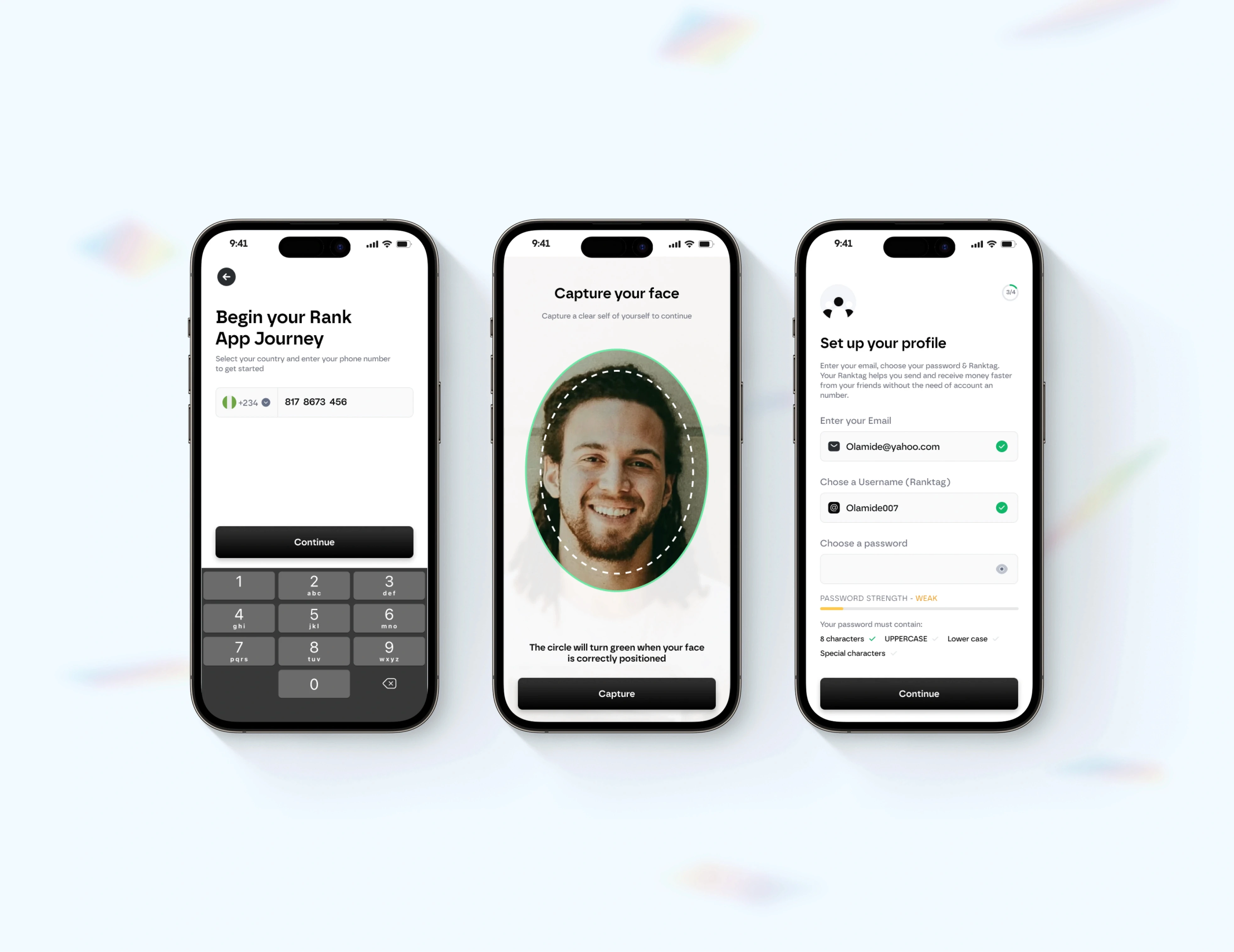
Let users select their country up front to support EU/NA onboarding. Replaced mandatory ID photo capture with simple ID-number entry, reducing friction.
Rebuilt onboarding around time-to-first-value, collecting all required KYC inputs before users land in the app so they hit fewer blocks later.
Ensured the KYC flow matches CBN tier rules while still meeting EU/NA privacy and risk expectations.
Stopped interrupting primary tasks with forced upgrades; allowed users to complete what they came to do.
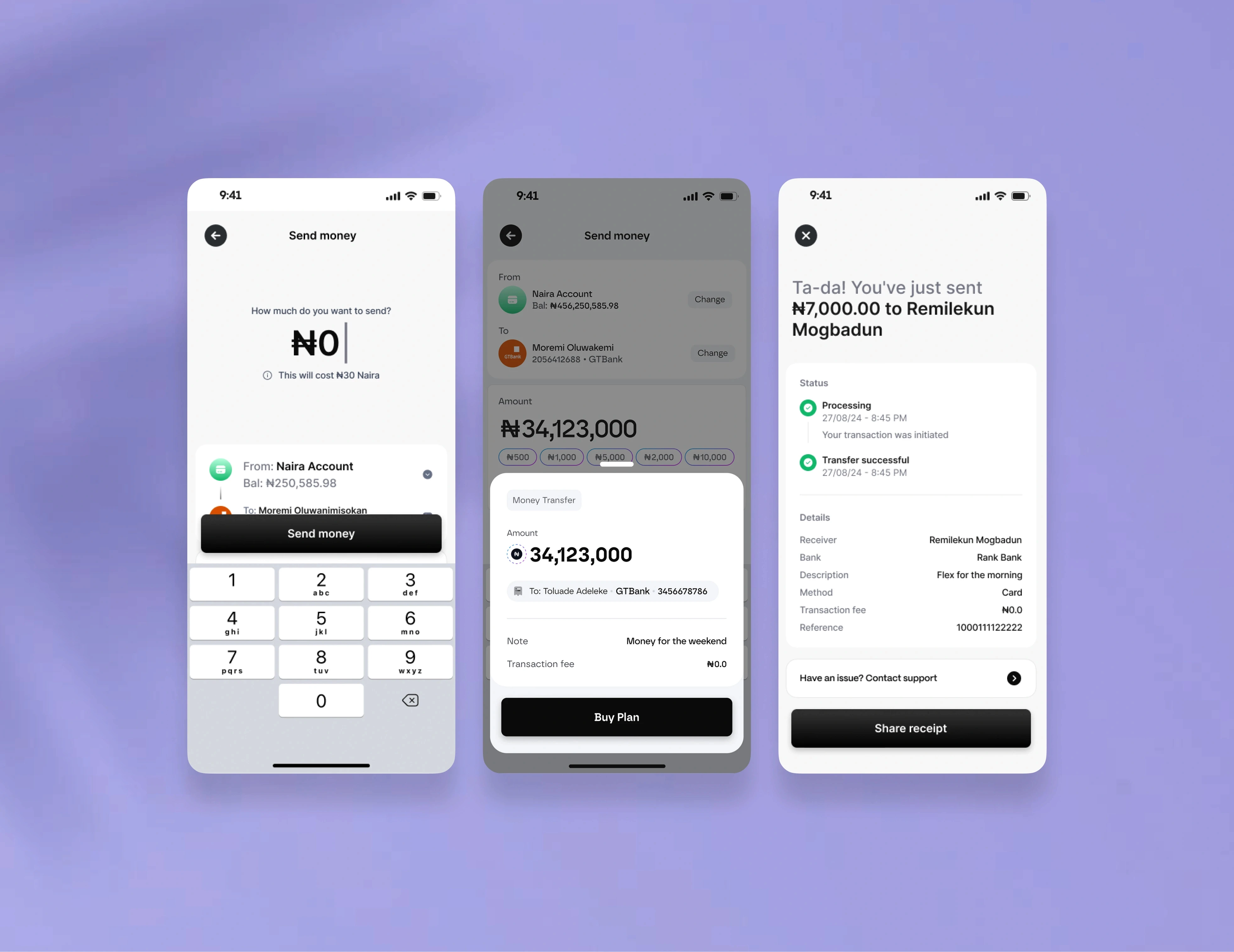
Rewrote error states for clarity and added recovery pathways for failed submissions.
This merged Western UX expectations with Moni’s African-market strengths while supporting diaspora-focused features like ROSCA (group savings/credit).
My job was never to digitise the trust people already had in their circle. It was to make sure the app deserved it. So I stopped designing the verification flow and started designing the feeling around it. Every decision below is a trust decision wearing the clothes of a UX one.
Ask for trust before you ask for patience. The hardest trade-off was sequence, not length. I could have shortened the steps and still lost people, because the problem was never the count — it was the order. So I let people get further into the product, feel why the circle was worth it, before the app asked them to prove anything. Show value before you ask for proof. Then the ask lands as a reasonable request between people who already have a reason to trust each other, not a stranger demanding papers at the door.
Gather quietly, block rarely. I moved the identity questions earlier and lighter — including which country someone was joining from, so the cousin abroad was met properly from the first screen instead of squeezed into a flow built for somewhere else. Collected once, calmly, instead of ambushing someone mid-task later. The point wasn’t speed for its own sake. It was that nobody should hit a barrier at the worst possible moment, right after they’d finally committed.
Turn an intimidating demand into something small and human. One of the most loaded moments was being asked to photograph an ID — it feels like surveillance, like being suspected. Where the rules allowed, I let people simply type an ID number instead. Same compliance, none of the menace. A small change that quietly says: we’re not interrogating you.
Stop interrupting people who are already here. The forced upgrade that ambushed people mid-task is gone. When someone is in the middle of what they came to do, I let them finish. Pulling someone out of a task to demand more of them is how you teach them the app doesn’t trust them either — and trust only travels in both directions.
Never leave anyone at a dead end without a hand reaching back. I rewrote every failure to do two things: say plainly what happened, and offer a way forward. A wrong turn should feel like someone steadying your arm, not a door closing. Nobody gets stranded.
Underneath all of it, I was holding two worlds together — the cleaner expectations people bring from Western products, and the deep, lived strength of how Nigerians, including the diaspora, already trust and save together. The flow had to sit squarely inside the CBN’s tier rules and hold up to the privacy and risk expectations of the markets Moni was growing toward. Compliance stayed strict. It just stopped feeling like an accusation. None of these moves are clever. That’s the point. I wasn’t trying to digitise the trust. I was trying to make the app deserve it.
Letting More People In, Without Losing Anyone
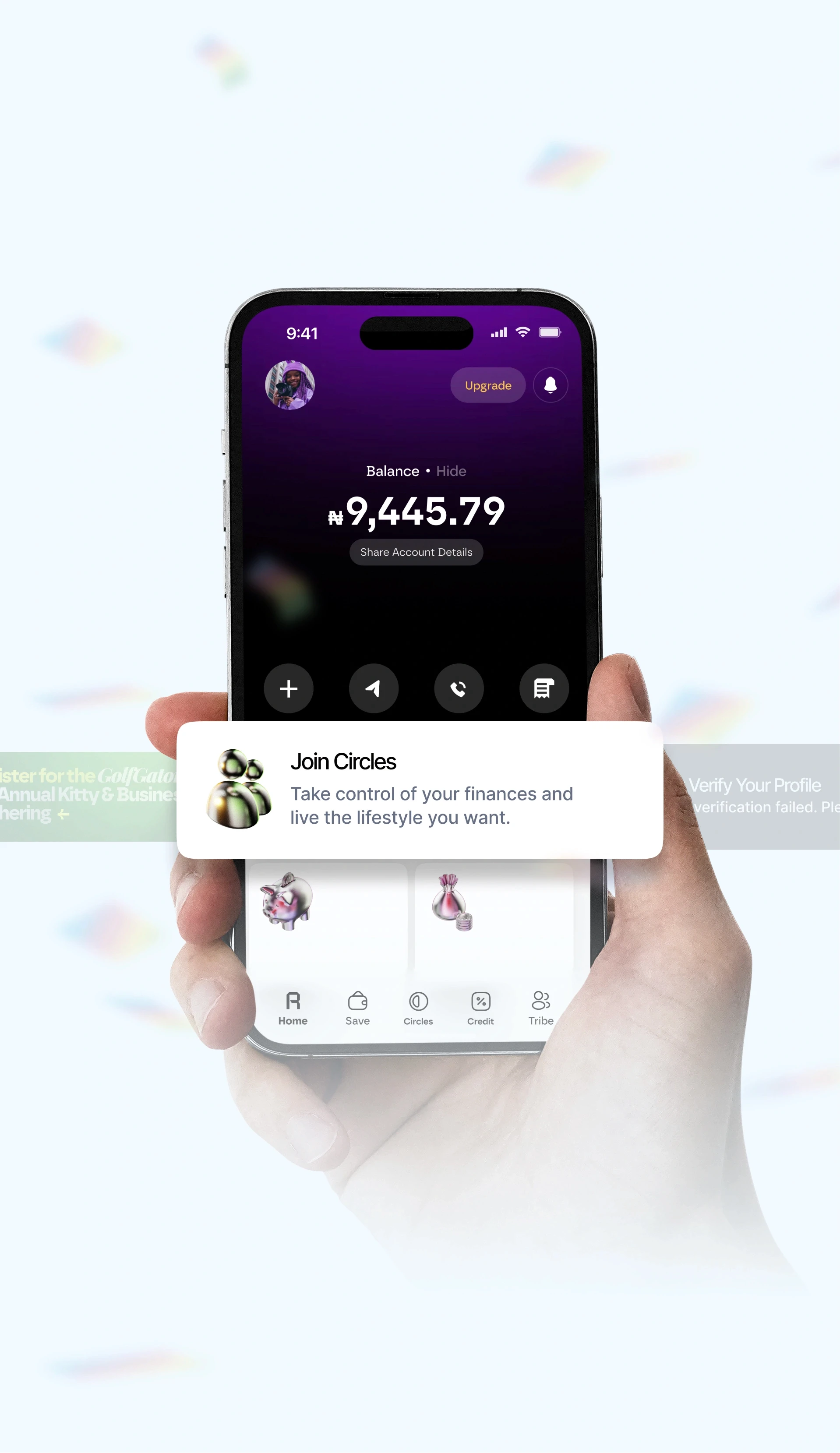
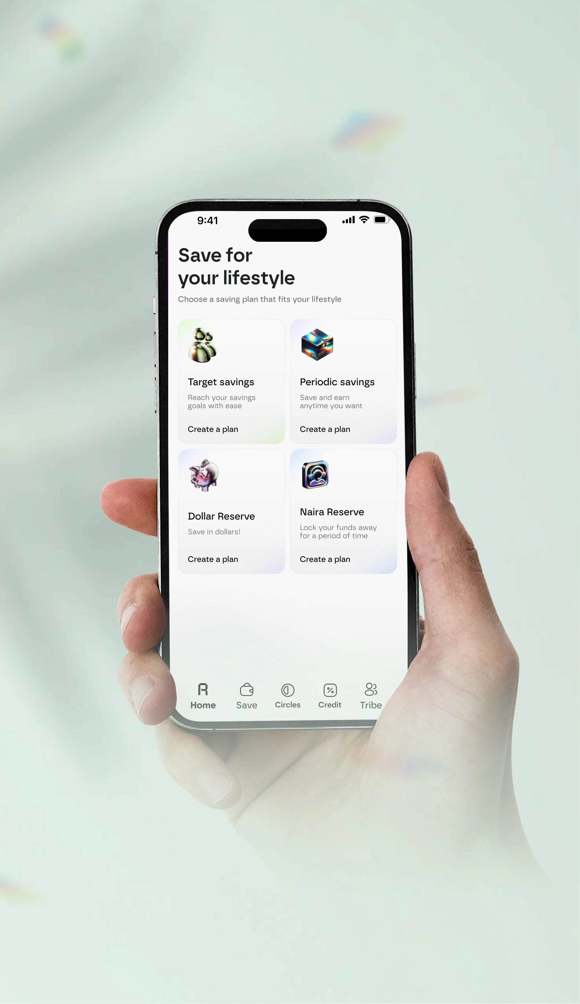
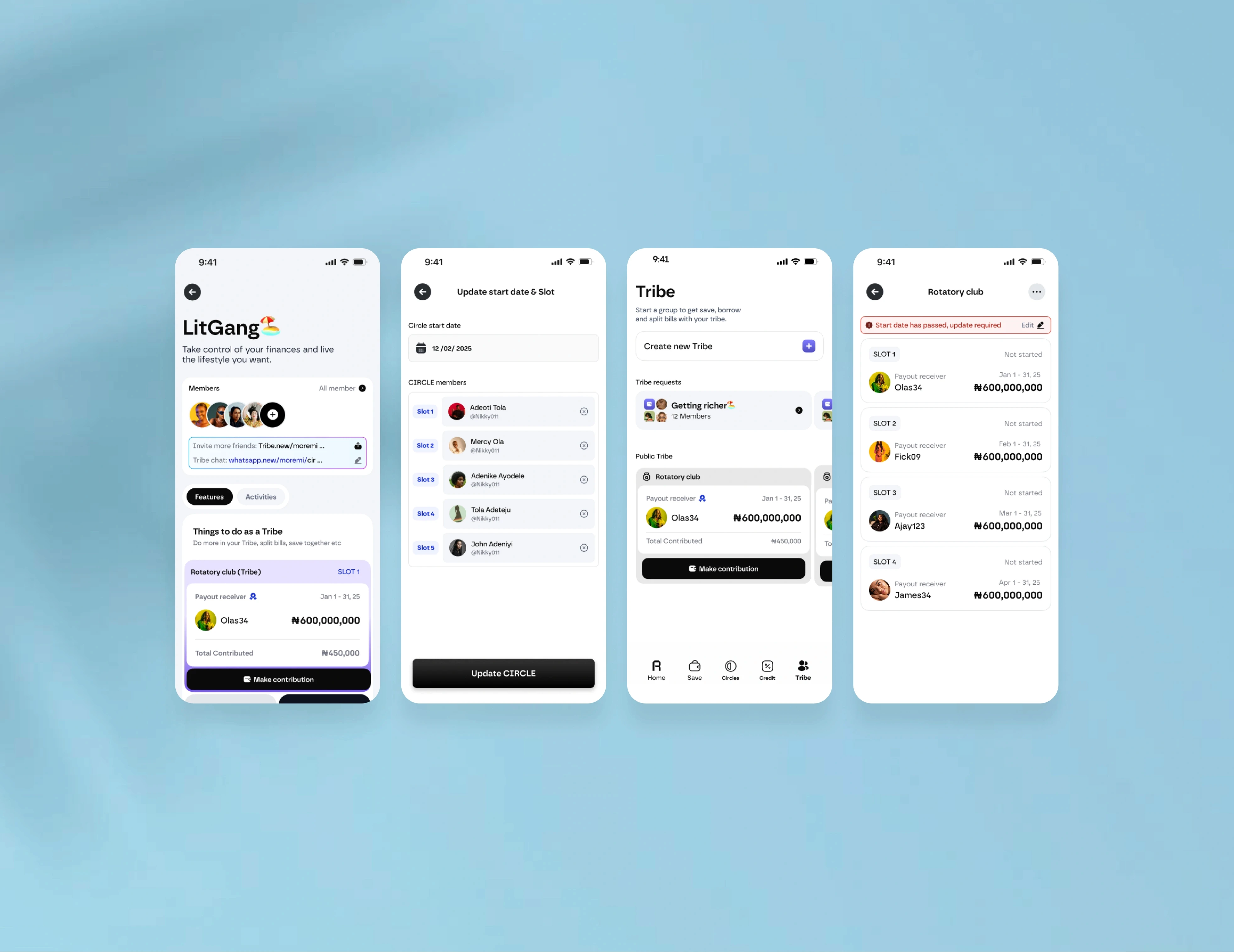
To support expansion, we introduced new product surfaces such as savings circles (Ajo) and diaspora-focused financial tools, ensuring they were discoverable without increasing complexity.
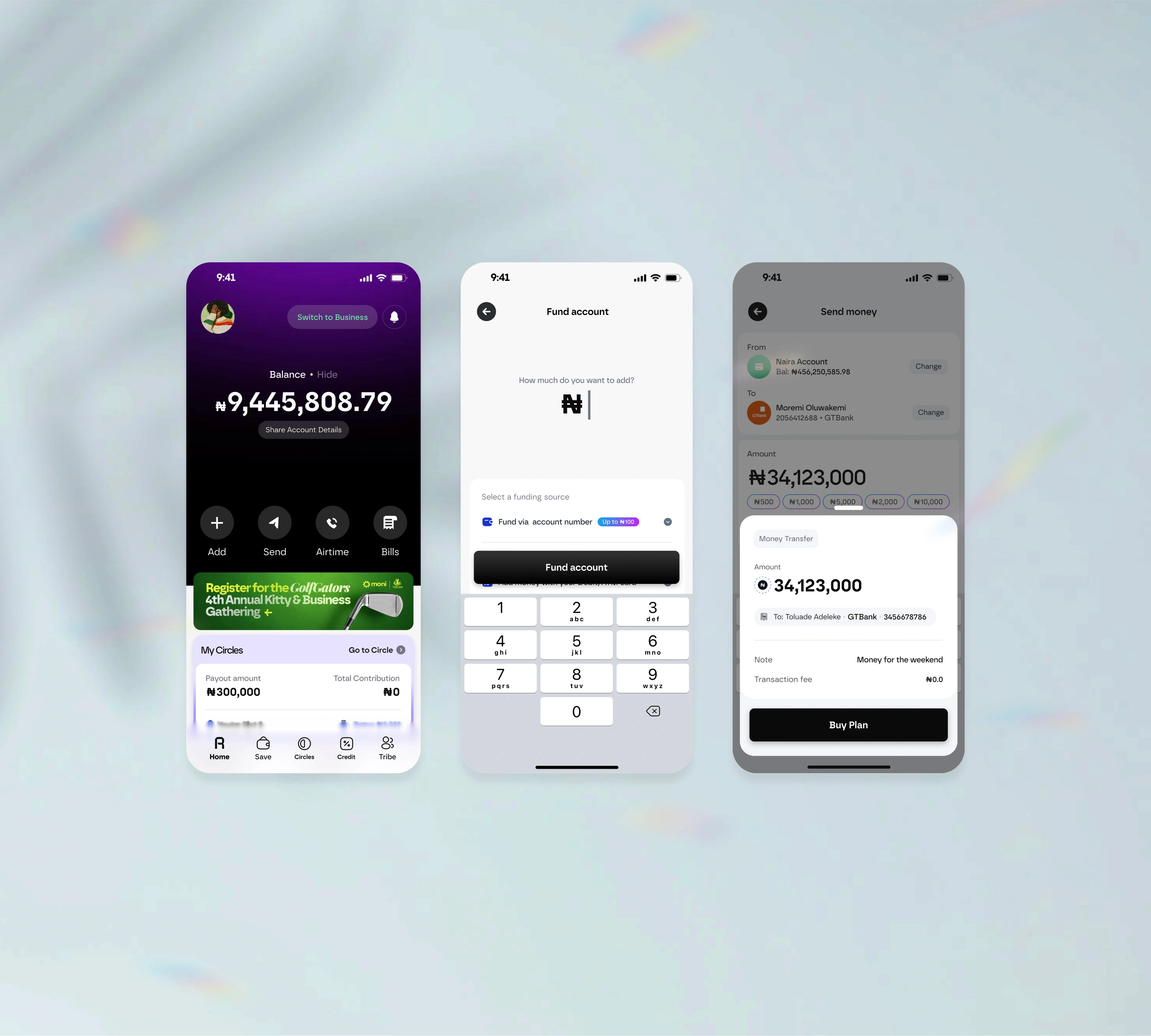
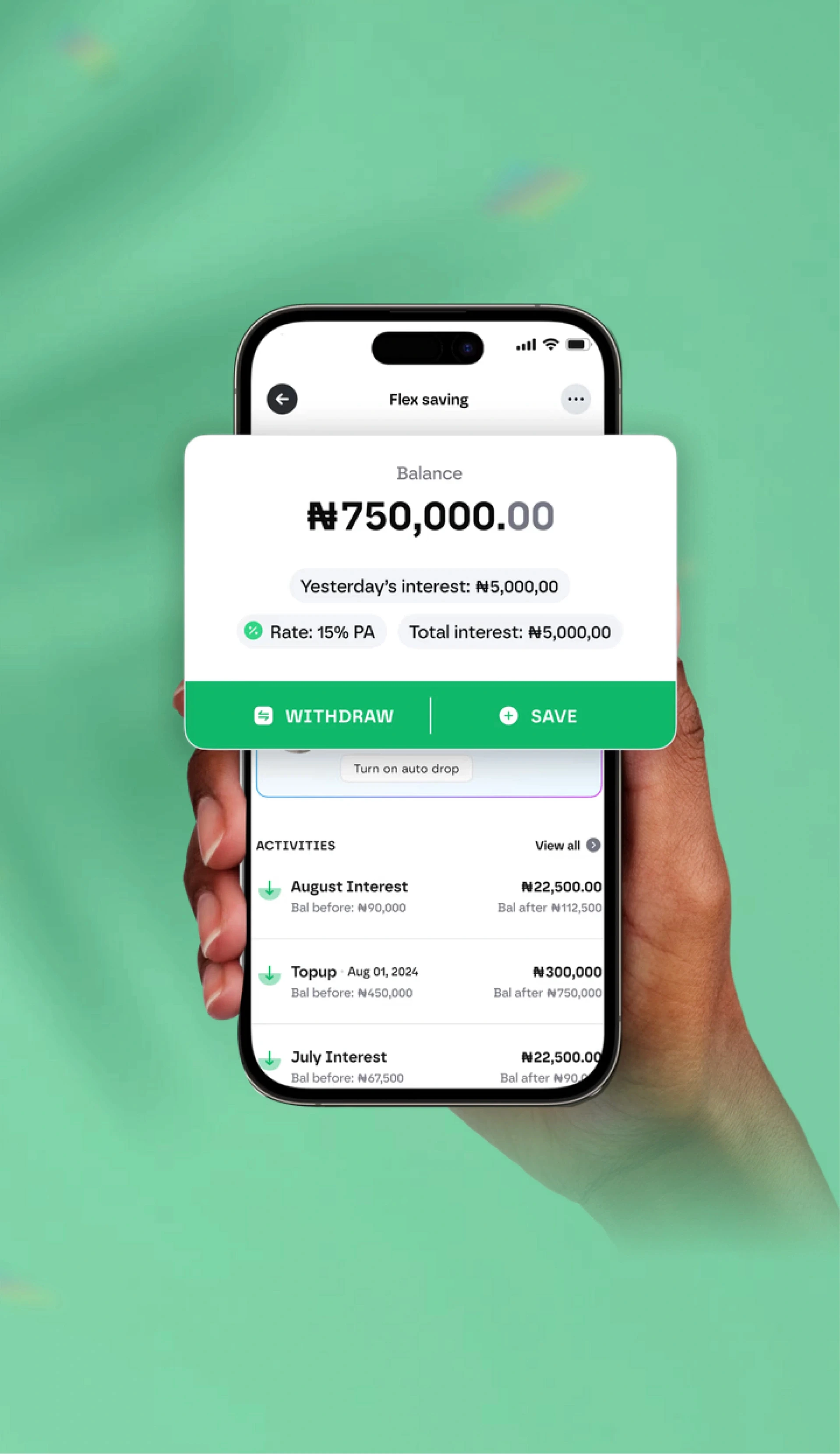
The home experience was redesigned into a central financial hub, giving users a clear overview of their financial health through contextual, priority-based information—surfacing what mattered most in the moment, whether that was a pending KYC upgrade, an active savings goal, or participation in a group contribution.
Growth, to me, was never about reach as a number on a slide. It was a simpler, harder question: can more people walk through the same door, and still feel held the way the first one did?
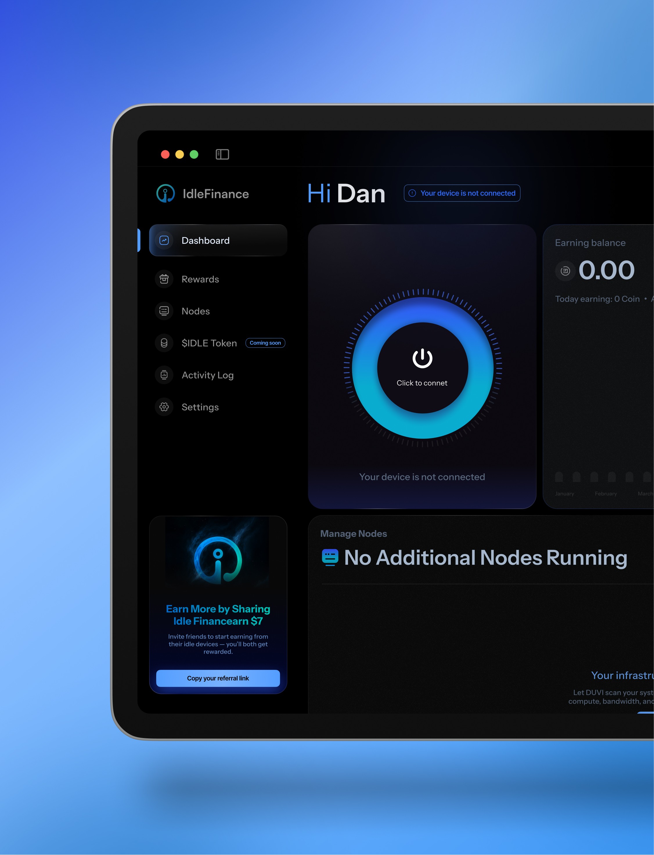
The diaspora makes that vivid. A friend in Lagos shows you Rank, then sends a link to your sister abroad — the way Esusu has always spread, one trusted person vouching to the next. If she lands on something that looks and feels like a different product than the one she was shown, the trust her friend handed her quietly drains out. So when the product showed up on the web as well as the app, I built one design language across both. Not for tidiness. For trust. For money built on community, consistency is a trust signal. A referral is someone vouching for you with their own name; the least the product can do is be recognisable when the person they vouched for arrives.
Clarity over cleverness. I rebuilt the home around the questions people actually ask, in the order they ask them — what is this, how does it work, why should I believe you. Instead of a wall of features, it surfaces what matters in the moment: a verification step still waiting, a savings goal quietly moving, a turn coming up in your Esusu or Ajo circle. The home isn’t a dashboard showing off. It’s an answer to the question someone is privately holding: is my money, and my people’s money, okay?
Letting more people in meant letting them in the same way. Same calm, same honesty, same refusal to make anyone feel small for not understanding yet — the everyday working person, the saver building something quietly, treated with care and never reduced to a segment.
Prosperity, Made Common
Upgrade abandonment reduced to 13%, down from 28%. 86% of users agreed Upgrade was quick & easy
Product positioned for international expansion while reducing HNI cost-to-serve through product-led activation.
Clearer onboarding improved feature discoverability and reduced time-to-value
User ratings increased from 3.5 to 4.7 stars, demonstrating that real-time tracking and reliable delivery significantly improved satisfaction.
I keep coming back to her. The woman who downloaded the app because her sister told her to, and braced to be turned away from her own money one more time.
This time, she wasn’t.
More people made it through the door without ever feeling like they’d failed. The moment that used to break someone — that verification screen where she braced to be embarrassed — stopped being where the story ended. People came in trusting their circle, and left trusting the app that held it, because for once the app had earned it instead of demanding it. The ones who used to stall and quietly disappear now reach the things they actually came for: the saving, the circle, the small shared future they were building all along. When something goes wrong, a hand reaches back instead of a closed door. And the cousin abroad opens the same product her family showed her, and believes it, because it’s plainly the same one.
Compliance still does its serious job — the rules are honoured, the money is protected — but it no longer feels like a wall someone has to apologise for hitting.
Esusu was always a promise: prosperity, made common. Wealth that belongs to everyone in the circle, not just the one who got lucky. That line only means something if the person most likely to be shut out can actually walk through the door. The work was making sure she could.
She didn’t fail. The door did. Designing that door was my job.
I think about her every time I open a new file.


Rank App
Designing for Shared Prosperity
About Project
As Moni prepared for international expansion, activation issues caused most users to stall at lower tiers before reaching product value. I led the redesign of Rank to fix onboarding friction, align with CBN compliance, and reduce upgrade drop-offs using research-driven insights from funnels, usability tests, and KYC audits.
I led the redesign of Rank to unblock onboarding, reduce upgrade friction, and align the product with CBN requirements while laying a compliant foundation for EU and North American markets.
Long before there were banks in Nigeria, there was Esusu. Ajo. A circle of people who put their money together every week and took turns being lifted by it. No contracts. No paperwork. Just neighbours, market women, family — and their word. That word held for generations. It built homes, paid school fees, started businesses. Community-powered wealth, not individual hustle.
Moni — now Rank — set out to carry that into an app. To take something Nigerians have trusted for generations and put it in a phone, available to anyone, anywhere.
That’s a beautiful idea. It’s also a fragile one. Because the trust in Esusu was never in an institution. It lived between people. The moment you move it into an app, you ask someone to trust software with the thing their grandmother trusted only to her own circle.
I led the redesign of Rank as it prepared to grow beyond Nigeria — to the diaspora and into new markets. On paper, my brief was onboarding, verification, and aligning with the CBN’s requirements while building a foundation that could stand in Europe and North America. But underneath all of that was one quiet question I kept coming back to: does this app deserve the trust people are being asked to hand it?
Everything I designed was an answer to that. I didn’t think of it as fixing an onboarding flow. I thought of it as designing the door — and making sure the right person could walk through it without feeling like they’d failed.
Design Lead
Motion design
UX/UI Design
Website
Prototyping
The Problem
KYC and upgrade friction stopped users at lower tiers, preventing them from reaching core product value.
Users frequently got stuck at lower tiers due to complex upgrade requirements, resulting in significant user drop-off before they could experience the full product value. The comprehensive challenge list included:
Users Stuck at Lower KYC Tiers
Most new users stalled at Tier 1 due to complex upgrade requirements, preventing them from accessing critical features and experiencing the full product
Misalignment With Compliance Frameworks
The onboarding flow did not clearly align with CBN KYC tier rules, nor did it meet the higher compliance and data-privacy expectations required for EU and North American markets.
Blocked Activation and Expansion
These issues reduced activation, slowed Tier-2 upgrades, and limited Rank’s ability to scale internationally.
There’s a woman I keep coming back to. She’s been part of a savings circle her whole adult life — her mother ran one, her aunties ran one, and when it’s her turn to collect, the money is already spoken for: school fees, a deposit, a small business that’s been waiting on her. She trusts that circle completely. She has never needed a contract for it.
Then she downloads the app that’s supposed to hold it.
And somewhere on a verification screen, she stops. Not because the button is hard to find. Because she’s bracing to be embarrassed again — by the screen, by a system she half-expects to tell her she doesn’t qualify for her own money. She trusts the circle. She does not yet trust the thing holding the circle’s money. Behind that tap, that transfer, that balance is a person deciding whether to believe us — and right here, she doesn’t.
You come in wanting to save with your people. You get asked to prove who you are before you’ve felt a single reason to believe in the app. And when proof gets hard — a photo that won’t take, a step that loops, an error that explains nothing — you don’t think the system failed. You think you did. You close the app a little ashamed, and you go back to doing it the way your aunties did.
That’s the quiet shame of being locked out of your own money. And it was happening at the threshold, every day.
Stuck at the front, never reaching the point. Most new people never got past the first tier of access. The savings, the circles, the sense of a shared future — everything that made Moni worth trusting sat on the other side of a wall they couldn’t get over. They left judging the whole product by its hardest moment.
A product built on community, asking like a stranger. The verification rules existed for real reasons — the CBN’s tier structure isn’t optional, and serious money deserves serious protection. But the way we asked made a community product feel like a border crossing. Compliance was being treated as a hurdle to clear instead of a promise to keep.
A promise that couldn’t keep across borders. The same wall that stopped a woman in Lagos would stop her cousin sending money home from London. The thing built to spread prosperity couldn’t get past its own front step. Every person who quietly gave up at the door was someone the circle lost. That’s not a stalled funnel. That’s a broken handshake.
Research & Insights
User analytics showed 76% of new users stalled at Tier 1, preventing them from accessing essential product value.
Product analytics showed heavy clustering at Tier 1, with a sharp decline once users encountered the upgrade requirement. Key Behavioral Findings, from both quantitative and qualitative data, five core insights emerged:
Forced upgrades broke task flow
The upgrade prompt appeared mid-action, interrupting users before they had fully experienced product value.
Verification latency killed momentum
Delays and retries eroded confidence, especially without progress indicators or reassurance.
Vague error states created dead ends
Failures lacked actionable guidance, causing users to loop or churn rather than recover.
I didn’t start in Figma. I started watching people try.
I sat with real sessions and traced exactly where people fell away. The pattern was almost cruel in how clear it was: people crowded at the first tier and then dropped at the precise moment we demanded proof — not because they couldn’t follow the steps, but because of how those steps made them feel. Watching a stranger freeze on a verification screen, you stop seeing a usability gap. You start seeing a person deciding whether to believe you.
That’s the reframe I had to fight for, because it runs against the industry’s first instinct. We keep pretending it’s a design problem. Make the button bigger, clean up the flow, add a progress bar. Treat the people leaving as if they were confused.
They weren’t confused.
It’s not a design problem. It’s fear.
Drop-off is behaviour, not failure. It’s fear, not confusion. And once I held that as true, three things became obvious.
The ask came before the reason. The demand for verification landed mid-action, right as someone was reaching for the thing they came to do. We were asking for trust before we’d given a single reason to extend it. You can’t ask for trust at a door you haven’t let someone walk through yet.
Waiting in silence felt like being doubted. When verification took its time, nothing on the screen reached back. To us it was a slow system. To someone already half-expecting to be shut out, silence reads as suspicion. In that quiet, a delay didn’t feel like a delay. It felt like being turned away — the exact thing she’d braced for.
A dead end confirmed the worst story. When something failed, the screen gave nothing to do next. And a person already half-expecting to be locked out reads a blank failure as a verdict: not “try again,” but “you don’t belong here.”
The obvious fix — smoother forms, tidier copy — would have missed all of this. The real work was sociology before screens. Every screen in this app is just a person deciding whether to believe us, and I had to design for that decision, not for the tap.
How it was solved
I designed the onboarding flow to collect all necessary identification details upfront, reducing friction and preventing drop-offs by:
Let users select their country up front to support EU/NA onboarding. Replaced mandatory ID photo capture with simple ID-number entry, reducing friction.
Rebuilt onboarding around time-to-first-value, collecting all required KYC inputs before users land in the app so they hit fewer blocks later.
Ensured the KYC flow matches CBN tier rules while still meeting EU/NA privacy and risk expectations.
Stopped interrupting primary tasks with forced upgrades; allowed users to complete what they came to do.
Rewrote error states for clarity and added recovery pathways for failed submissions.
This merged Western UX expectations with Moni’s African-market strengths while supporting diaspora-focused features like ROSCA (group savings/credit).
My job was never to digitise the trust people already had in their circle. It was to make sure the app deserved it. So I stopped designing the verification flow and started designing the feeling around it. Every decision below is a trust decision wearing the clothes of a UX one.
Ask for trust before you ask for patience. The hardest trade-off was sequence, not length. I could have shortened the steps and still lost people, because the problem was never the count — it was the order. So I let people get further into the product, feel why the circle was worth it, before the app asked them to prove anything. Show value before you ask for proof. Then the ask lands as a reasonable request between people who already have a reason to trust each other, not a stranger demanding papers at the door.
Gather quietly, block rarely. I moved the identity questions earlier and lighter — including which country someone was joining from, so the cousin abroad was met properly from the first screen instead of squeezed into a flow built for somewhere else. Collected once, calmly, instead of ambushing someone mid-task later. The point wasn’t speed for its own sake. It was that nobody should hit a barrier at the worst possible moment, right after they’d finally committed.
Turn an intimidating demand into something small and human. One of the most loaded moments was being asked to photograph an ID — it feels like surveillance, like being suspected. Where the rules allowed, I let people simply type an ID number instead. Same compliance, none of the menace. A small change that quietly says: we’re not interrogating you.
Stop interrupting people who are already here. The forced upgrade that ambushed people mid-task is gone. When someone is in the middle of what they came to do, I let them finish. Pulling someone out of a task to demand more of them is how you teach them the app doesn’t trust them either — and trust only travels in both directions.
Never leave anyone at a dead end without a hand reaching back. I rewrote every failure to do two things: say plainly what happened, and offer a way forward. A wrong turn should feel like someone steadying your arm, not a door closing. Nobody gets stranded.
Underneath all of it, I was holding two worlds together — the cleaner expectations people bring from Western products, and the deep, lived strength of how Nigerians, including the diaspora, already trust and save together. The flow had to sit squarely inside the CBN’s tier rules and hold up to the privacy and risk expectations of the markets Moni was growing toward. Compliance stayed strict. It just stopped feeling like an accusation. None of these moves are clever. That’s the point. I wasn’t trying to digitise the trust. I was trying to make the app deserve it.
Letting More People In, Without Losing Anyone
To support expansion, we introduced new product surfaces such as savings circles (Ajo) and diaspora-focused financial tools, ensuring they were discoverable without increasing complexity.
The home experience was redesigned into a central financial hub, giving users a clear overview of their financial health through contextual, priority-based information—surfacing what mattered most in the moment, whether that was a pending KYC upgrade, an active savings goal, or participation in a group contribution.
Growth, to me, was never about reach as a number on a slide. It was a simpler, harder question: can more people walk through the same door, and still feel held the way the first one did?
The diaspora makes that vivid. A friend in Lagos shows you Rank, then sends a link to your sister abroad — the way Esusu has always spread, one trusted person vouching to the next. If she lands on something that looks and feels like a different product than the one she was shown, the trust her friend handed her quietly drains out. So when the product showed up on the web as well as the app, I built one design language across both. Not for tidiness. For trust. For money built on community, consistency is a trust signal. A referral is someone vouching for you with their own name; the least the product can do is be recognisable when the person they vouched for arrives.
Clarity over cleverness. I rebuilt the home around the questions people actually ask, in the order they ask them — what is this, how does it work, why should I believe you. Instead of a wall of features, it surfaces what matters in the moment: a verification step still waiting, a savings goal quietly moving, a turn coming up in your Esusu or Ajo circle. The home isn’t a dashboard showing off. It’s an answer to the question someone is privately holding: is my money, and my people’s money, okay?
Letting more people in meant letting them in the same way. Same calm, same honesty, same refusal to make anyone feel small for not understanding yet — the everyday working person, the saver building something quietly, treated with care and never reduced to a segment.
Prosperity, Made Common
Upgrade abandonment reduced to 13%, down from 28%. 86% of users agreed Upgrade was quick & easy
Product positioned for international expansion while reducing HNI cost-to-serve through product-led activation.
Clearer onboarding improved feature discoverability and reduced time-to-value
User ratings increased from 3.5 to 4.7 stars, demonstrating that real-time tracking and reliable delivery significantly improved satisfaction.
I keep coming back to her. The woman who downloaded the app because her sister told her to, and braced to be turned away from her own money one more time.
This time, she wasn’t.
More people made it through the door without ever feeling like they’d failed. The moment that used to break someone — that verification screen where she braced to be embarrassed — stopped being where the story ended. People came in trusting their circle, and left trusting the app that held it, because for once the app had earned it instead of demanding it. The ones who used to stall and quietly disappear now reach the things they actually came for: the saving, the circle, the small shared future they were building all along. When something goes wrong, a hand reaches back instead of a closed door. And the cousin abroad opens the same product her family showed her, and believes it, because it’s plainly the same one.
Compliance still does its serious job — the rules are honoured, the money is protected — but it no longer feels like a wall someone has to apologise for hitting.
Esusu was always a promise: prosperity, made common. Wealth that belongs to everyone in the circle, not just the one who got lucky. That line only means something if the person most likely to be shut out can actually walk through the door. The work was making sure she could.
She didn’t fail. The door did. Designing that door was my job.
I think about her every time I open a new file.